The Building Blocks of Transit Maps: Empathy and Simplicity
2 March 2026

During my first few weeks at Sarg, a transit map for a Metropolis in India was the first project I was given to work on. Initially it began as a project rooted in an existing structure and design language and the more I worked on it, the more I began to realise I wasn’t just working with lines and data.
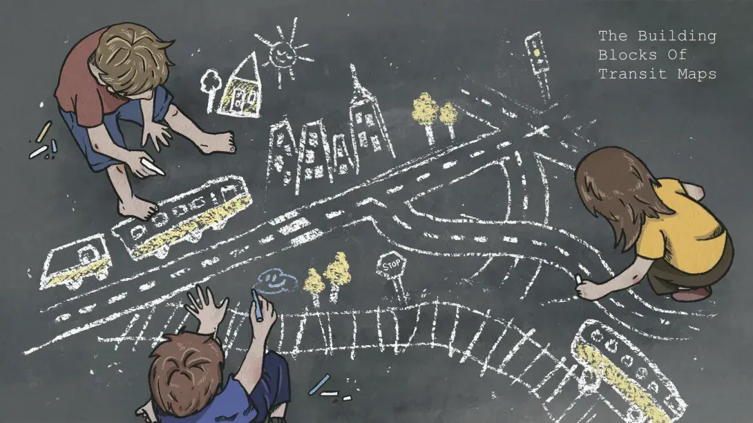
One of the first things that came to mind when I started working on the transit map was how, as kids, we used to draw roads and routes on the ground with chalk. It was simple. We didn’t need Google Maps or instructions. Just instinct, imagination, and a sense of direction that made perfect sense to us.
Transit Maps, as I've come to understand it, aren't just maps in the traditional sense. It doesn't show you just the city as it is but rather how to move through it. It's a tool for people in transit looking for clarity in a moment of motion. And under that, there’s more than one kind: line maps, platform maps, fare maps and so on. Each one serves a similar purpose, just at different moments and locations in the commute.
In the time I spent learning and researching in the studio, I found myself equally absorbed in trying to make sense of the city’s geography. Understanding the physical shape and layout of the place felt just as essential as decoding its transit system. It needed to feel local, recognisable and memorable; almost like a hand drawn sketch or a portrait of the city. Something so intuitively shaped that even a child could recall and redraw it from memory. That’s the kind of clarity and familiarity that would make a reader comfortable.
With more detail came more visual clutter. There was a fine and confusing line between being informative and being overwhelming. I had to ask myself:
Who is this map really for? And what do they need in the moment they’re looking at it?
When a person is in motion, especially under time pressure or uncertainty, they don’t need perfect realism, they need clarity. And that’s where simplicity becomes a tool of empathy. They need something that’s calm, clear, and easy to follow.
Empathy, in the context of transit, isn’t just about designing for accessibility. A system that understands not just the layout of the city, but the commuters need to make sense of it, fast. It is also about, recognising how people mentally map their routes.
At first, simplifying the city felt like watering it down. I found myself questioning how much I could abstract without losing its identity. Every bend in the road, every nuance of the layout felt important. It was a mindset shift to move from “Is it accurate?” to “Is it helpful?”. It became a learning curve for me to understand how to think more upon usability than accuracy. The goal wasn’t to distort the city, but to reframe it.
To ground my process, I looked at transit maps worldwide, starting with Henry Beck’s 1933 London Underground map. By treating the metro like a circuit diagram, Beck prioritised clarity over geography, changing how people understood and used the system.
One challenge was balancing visuals and titles. As the schematic took shape, it felt less like making a map and more like choreographing movement. This caused a shift in my focus from geography to experience.
Another challenge was designing in two languages; English and the local script. It wasn’t just about translation, but understanding how letters behave. Stacking, stretching, and occupying space differently. Typography became a spatial puzzle.
A major part of different transit maps would also be a legend. As a map’s translator, it helps commuters decode lines, interchange symbols, zones, directions. And that got me thinking; not just about what we include, but how we introduce someone to the map.
What does it mean to intuitively navigate?
Which direction am I going? Where does this line take me? Am I just one stop away from my destination or six?
A well-designed transit map should answer these questions. It should reduce hesitation and build confidence. It can actually persuade someone to use the system, to utilize transport interconnectivity, and to choose public transport as a reliable option.
I'm still learning. Still adjusting, questioning, going back and redoing things I thought were final. Subtle creative decisions shape the legibility of the map and the ease with which a commuter understands it.
If it can make someone feel more confident about using the system, it’s already doing its job. Because in the end, a transit system is only as useful as it is understandable. A map isn’t just a tool; it’s a reflection of how we choose to communicate complexity with care.
- Arundhati, Sarg Design Studio.