Guiding Hands: Designing for People Who Navigate Through Touch
2 March 2026
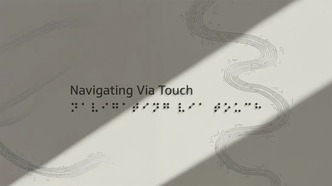
We often talk about design as something we see, may it be a colour palette, a typeface pairing or the subtle fall of a shadow. However, my recent experience while working on a project as an intern at Sarg made me realise that design is something more, it is something that people feel and experience. For the past few months, the focus has been on creating tactile maps where raised lines, braille dots, and icons replace screens and images. These maps are for people who navigate spaces without sight. For them, all senses except sight, work in cohesion and aid them in understanding a space.
At first, tactile signage seemed like something simple, a few raised surfaces and Braille for text, right? But as I started working on it and deep diving into what it means to design tactile signage, many questions came up that weren’t easy to answer. How do people read Braille? Is Braille enough or are other shapes and textures important too? How thick does a raised line need to be for someone to feel it clearly? Where should a sign be placed so that people can find and reach it comfortably? How can we convey a journey from one point to the other without complicating or clouding the person’s mind? These questions changed my approach towards the project and to some extent expanded my mindset too.
Braille is read letter by letter, slowly and carefully, using the fingertips. People move from left to right, like reading regular text, but they also use other clues like sound, and their memory to build a space in their mind. Tactile signs are easier to find if they are placed at a standard height. It also became clear that materials matter. Acrylic is smooth and good for indoor signs whereas metal is better for outdoor applications because it is durable and holds the texture well and does not risk yellowing or cracking like Acrylic. My biggest learning was that design in a public space cannot be centred for just one niche. Tactile maps cannot be made only for people with impaired vision, if a map is put up, it is going to be referred to by sighted people as well. At the same time symbols that might look clear to a sighted person don’t always work when read by touch. Due to this, one needs to design for visual aesthetics as well as for the physical touch.
Another realisation was that accessibility is most definitely not a special feature or a favour for the people with Ablepsia or other disabilities. It’s a part of how systems and spaces should ideally work. When designing for touch, the questions are not about style but about clarity and usability.
In spaces like airports, metro stations, university campuses, hospitals, and theatres, places where navigation is critical, I worked on creating tactile signage systems that could be accessed by everyone, especially the visually impaired. These aren’t just functional add-ons for compliance; they’re quiet enablers of independence and confidence.
Think of a theatre. When someone who is blind or visually impaired visits, the goal isn’t just to get them to their seat. They’re there for the same reason everyone else is, to experience the performance and to be immersed in the story, to enjoy their time and not be reminded of their disability. But without thoughtful design, their experience can begin with disorientation and unwarranted dependence. That’s where tactile signage steps in. They offer clarity without the theatrics, helping people navigate confidently, without needing to see, ask for help, or rely on technology.
In the beginning, it was easy to think of this as a niche project, only useful for a small group of people. But over time, it became clear that this is not just accessibility design, it's human centred design. Design that includes, rather than excludes. Good design, in this context, isn’t just about innovation, it’s about simplicity, accessibility, and dignity. It's about creating a world that’s a little easier to move through for everyone.
This project taught me something simple but essential: Public service design doesn’t just reach people, it’s meant for including them. If your space design doesn’t include accessibility, pull up another chair. If your product doesn’t work for everyone, it isn’t finished yet.
- Siddha, Sarg Design Studio.