Press Play on the Past
28 April 2026
Ever sieved through an old box of photographs and felt a surge of bittersweet emotions? Or went “LOOK WHAT I FOUND!” when a sponsored page of a video game inspired by Nintendo consoles being back in the market popped up on Instagram? Both of these hit hard because of nostalgia. A complex and powerful emotion that marks an important place in design. It would be safe to say, emotional design is the key to putting life into what would otherwise turn out to be cold.
Emotional design plays its role in three levels: visceral level, behavioral level, and reflective level. For example, whilst designing a product, the appearance, look and feel would nudge the user. It might create a sense of belonging or familiarity that elicits a response from them. This subconsciously triggers emotions or reactions or ways of usage in the user. That is the behavioural level of emotional design. Reflective level is what decides the success of your design recipe. When the user interacts with something, their personal experience, memories, culture, and emotional variation would affect their decision of using the product again, or not. In some cases, one level might overpower the other but that’s the beauty of it. I wonder how these levels play a role in graphic design since the visceral level would play such a huge role. Here, the floor is open for discussion (poke your colleague.) Nostalgia is an emotion used across various design outputs that plays on all three levels of emotional design. It is also an emotion which makes a trend not seem like a trend, instead a walk down the memory lane. Products, typography, marketing campaigns, photography, architecture, interiors, sound design, films, etc. have been using vintage aesthetics for quite a while now. This is exactly why certain visual and product choices feel so familiar yet fresh.
That’s why Instagram designed a polaroid camera like logo.
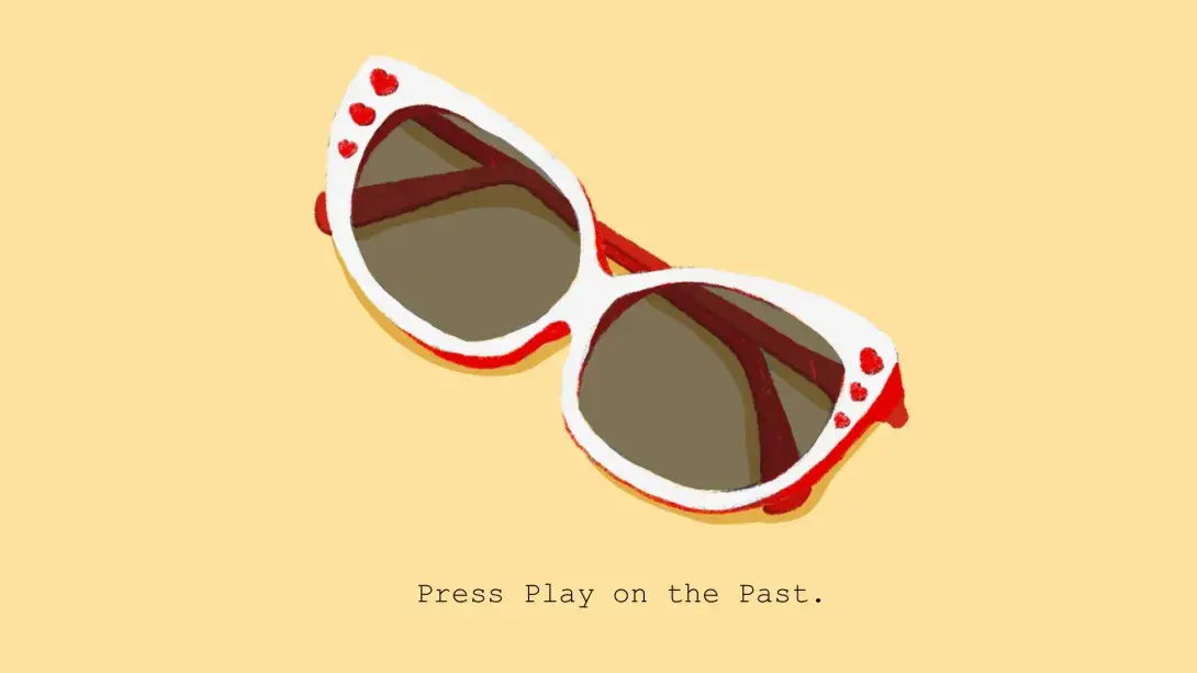
That’s why vintage Ray Bans are back on roadside shops.
That’s why cars are switching back to analog displays.
That’s why you are ready to spend that happy cabbage on a Casio watch.
That’s why films are using titles of old songs and recreating old songs. Even typography used in the opening credits or film posters is a sight for sore eyes.
But evoking nostalgia in design isn’t as simple as slapping on a retro filter. When it comes to designing experiences for spaces with nostalgia or for that matter even comfort, it is particularly challenging. The number of things that must be put together are immense. Starting from the tone of voice right up to the banner outside the space for marketing purposes. Color, material and finishes or the tangible aspects have to be in sync with the intangible aspects, like the narrative, information, and language of the space. All of these if put together well, make for a holistic experience that can evoke an emotion. If not, it’s meat served rare. Beyond aesthetics, nostalgia plays a crucial role in the documentation of cultures. Nostalgic design choices often trigger conversations, and trust me, this is a goldmine when it comes to ethnography, anthropology, or just plain user study. I think the human race also craves a sense of belonging. Off the cob, comfort is what we seek. Nostalgia is the most effective tool. Plain and simple.
This brings us to an interesting question: Do design movements and trends really renew every year or whenever they do? When trends come and go, they adapt to the contemporary society with some or the other influence. Rightly so, nothing comes out of a void. As humans, we are inspired by things around us. Hence emotional design works at both ends, the designer’s and the end users. That said, nostalgia in design comes with a cautionary note. As designers, it might happen that we take a trip down the memory lane ourselves but do come back in time or you will find yourself in a downward spiral with no contextual awareness of your target audience. While researching, a design research bias is also quite common and when dealing with emotions it can become more than just an objective bias. Be clear, stick to your target audience and don’t waver how enticing a Y2K colour palette might look, and you might take the egg.
- Sakshi, Sarg Design Studio.